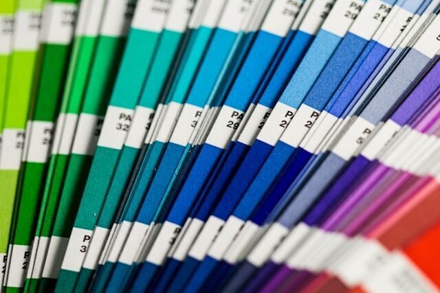
Selecting the right colors for direct mail is not all black and white. There isn’t necessarily one right color or one wrong color—but there are definitely good and bad choices. Engaging colors can draw attention to your direct mail piece, increase brand recognition and even get people to read it.
The wrong color may get your postcard tossed. Color selection should be strategic. Not all colors say the same thing, and once you do make your choice, how you implement color is important.
Here are some good rules to follow:
Marry your color with your message.
Colors have the power to make people feel certain ways, so select hues that reinforce (rather than contradict) your message. For example, many Americans associate gold with wealth, so using that color to promote a low-priced item could confuse your audience. Orange, however, is a playful and vibrant color that can make a product look more affordable. Or if you’re promoting something related to the environment, green is a natural choice. It’s already linked with eco-friendliness, so it makes sense.
Stay true to your brand.
Remember to consistently represent your logo and corporate colors throughout your marketing pieces. Regardless of the colors you choose, your brand colors should always be included.
Don’t let color interfere with readability.
Text is most legible when its color is highly contrasted with the background. Black on white is the easiest to read. Other legible combinations include black on yellow, red on white and blue on white.
Don’t use the whole rainbow.
Too many colors can make your piece look less sophisticated. Consider creating contrast by using different shades of the same color.
Finally, don’t discount the idea of using tinted paper. A soft-colored paper can add warmth to your message, for example. And printing one or two colors on tinted paper may be more cost-effective than using several inks on white paper. The right colors will make your direct mailings pop!